Overview
VRV is a streaming platform that brings together the best of anime, animation, gaming, and technology to U.S. fans in one unified environment. In the US, there are some competitors who sell the same services.
Outside the marketing side problem VRV has, the aim of this project is to show the design with better clarity, discoverability, and seamless experience in every feature to show the subscriber that VRV is worthy to have.
In this project, I have learned how to make responsive design to make website and mobile apps.
My Role : UX Designer
Team : 6 UX Designers
Tools : Figma, Zoom, Miro, Google docs
Timeline : 3 Months
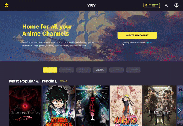
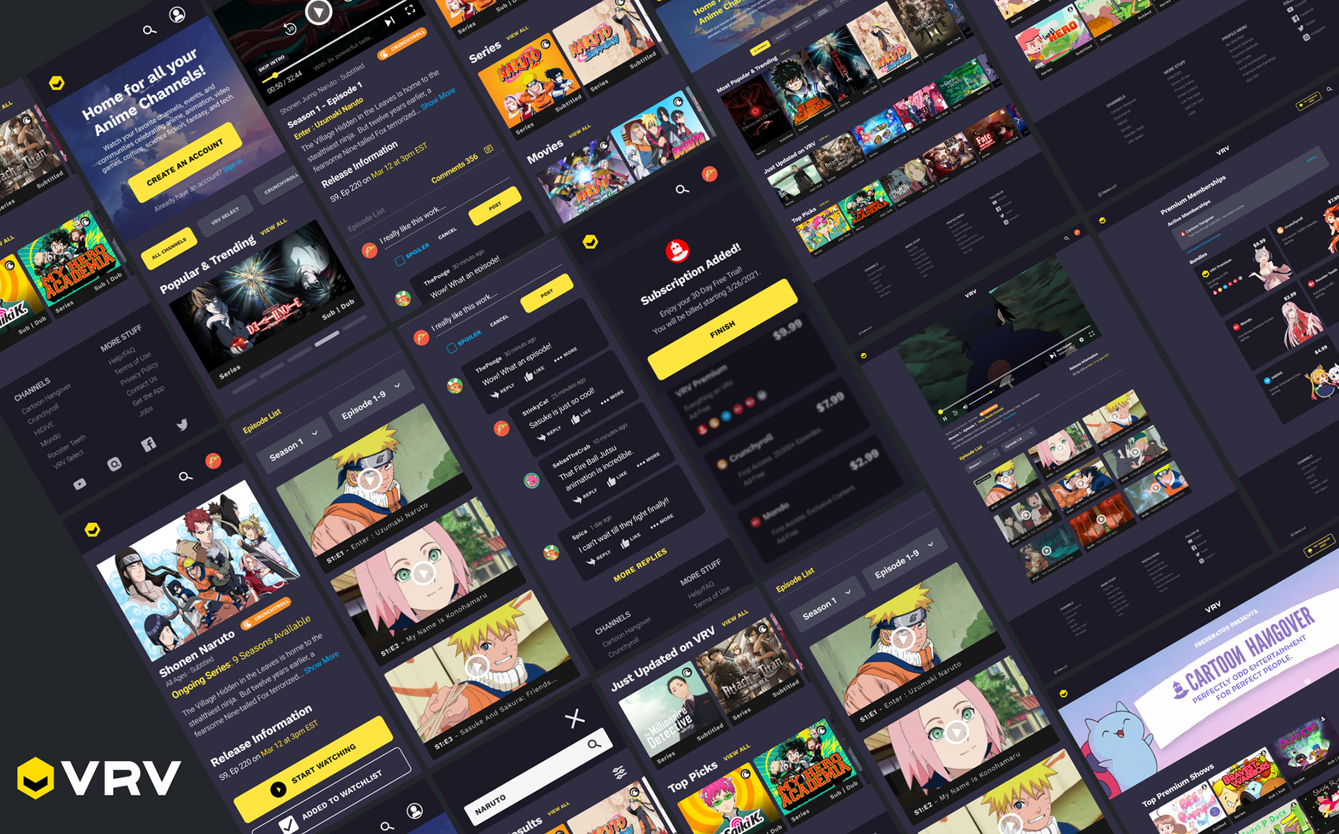
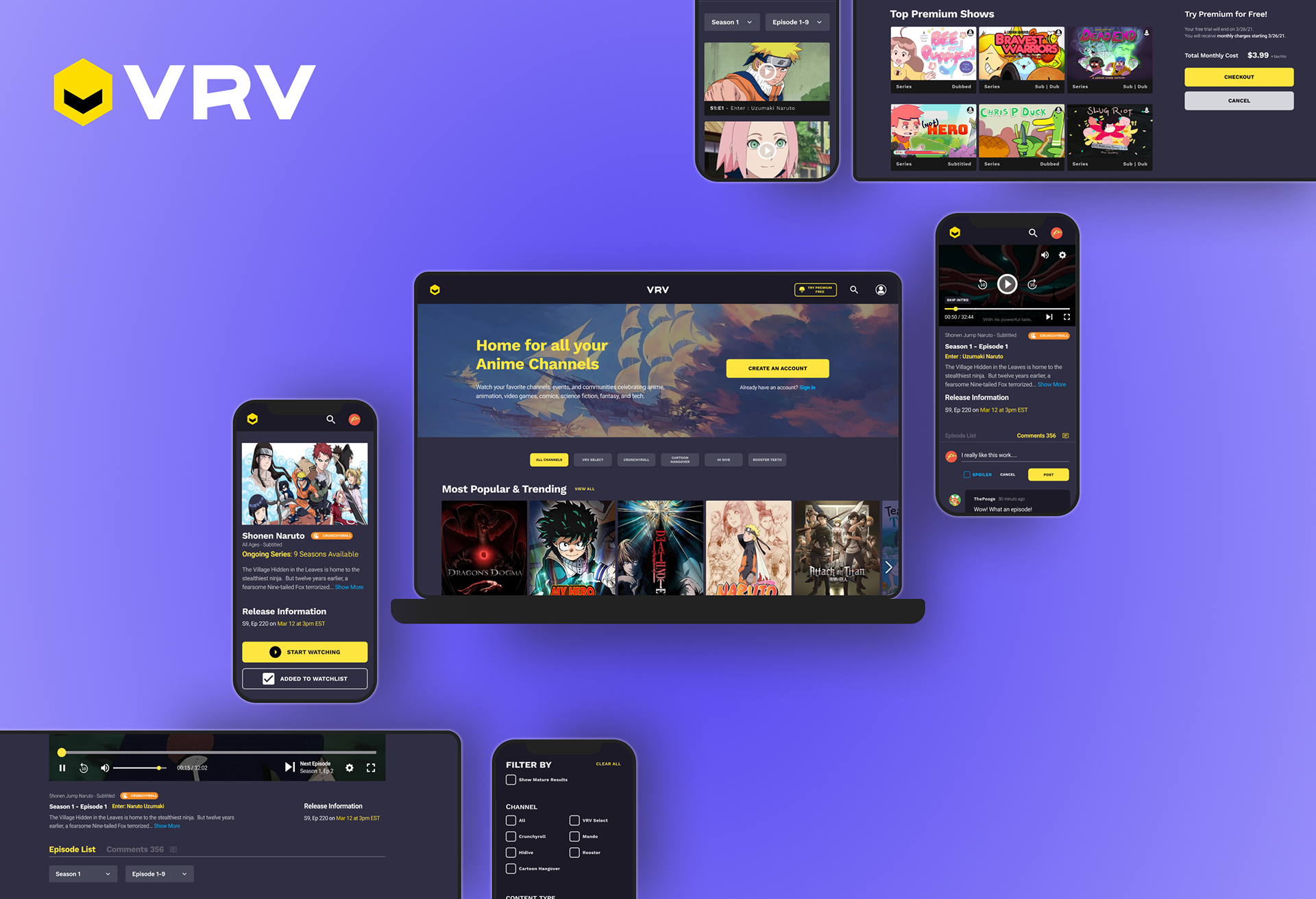
Redesigned VRV homepage
Problem
Watching streaming online at home will make users want a very seamless experience in browsing and discovering anime. Despite the looks of the VRV website, it has problems in organizing the content and the information in the homepage. User use the search often time makes the users are unable to get the full experience in discovering the content and purchasing the membership.
Scope and Restraints
Our scope was broad: a complete overhaul of the current platform which included a new responsive design for both web and mobile as well as an entire completed design system.
Our constraints were specific: to follow the functionality of the current platform, not straying from the current back end development as well as designing within the current UI.
What do users think of VRV?
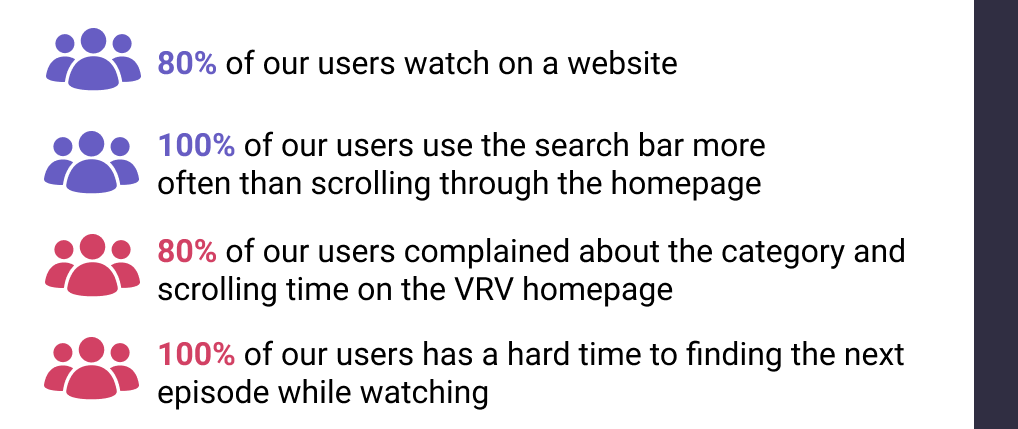
We interviewed 16 people to understand behavioral patterns while watching VRV versus the site they always use. This interview is useful because we want to think big and gather first easy problem that occurs in VRV. From the 16 people we interviewed, only 30% like to watch anime. Shockingly, all the people we interviewed didn’t know about VRV. The survey also shows that only 2 people out of 51 are familiar with VRV.
Findings in VRV :
Key Insight
1. Our users tend to compare the navigation and the looks with another platform
2. Users don’t like to scroll too much on navigation because the homepage shows too much content and categories that they do not need to see.
3. People used the search function first because they mostly knew what to watch, then wandered around on the homepage later if they didn’t know what they wanted to watch
4. People care about how easy it is to navigate/find the next episode when they are watching
Competitive analysis to get a better understanding of what others streaming services do
Before moving forward, it was important for us to see what other streaming services were offering online to their users. By taking our user’s pain points, we conducted a competitive analysis focusing on what other competitors have done right in comparison to our platform
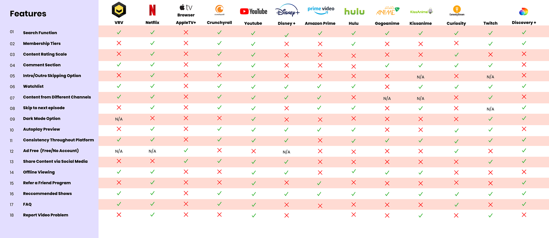
VRV almost has the same features as the competitor platforms. Based on this feature comparison:
1. Almost all of the competitors have an advanced search function
2. Half of the competitors have content from different media channel
VRV landed somewhat in the middle of the competition, it meant that there was a lot of room for improvement.
Implement card sorting and red routes to analyze the opportunity and pain points
Our competitor research is huge that we utilize card sorting method to analyze the findings we got. We implemented card sorting to categorize similar positive and negative findings from our competitor. This is a screen shot of our card sorting
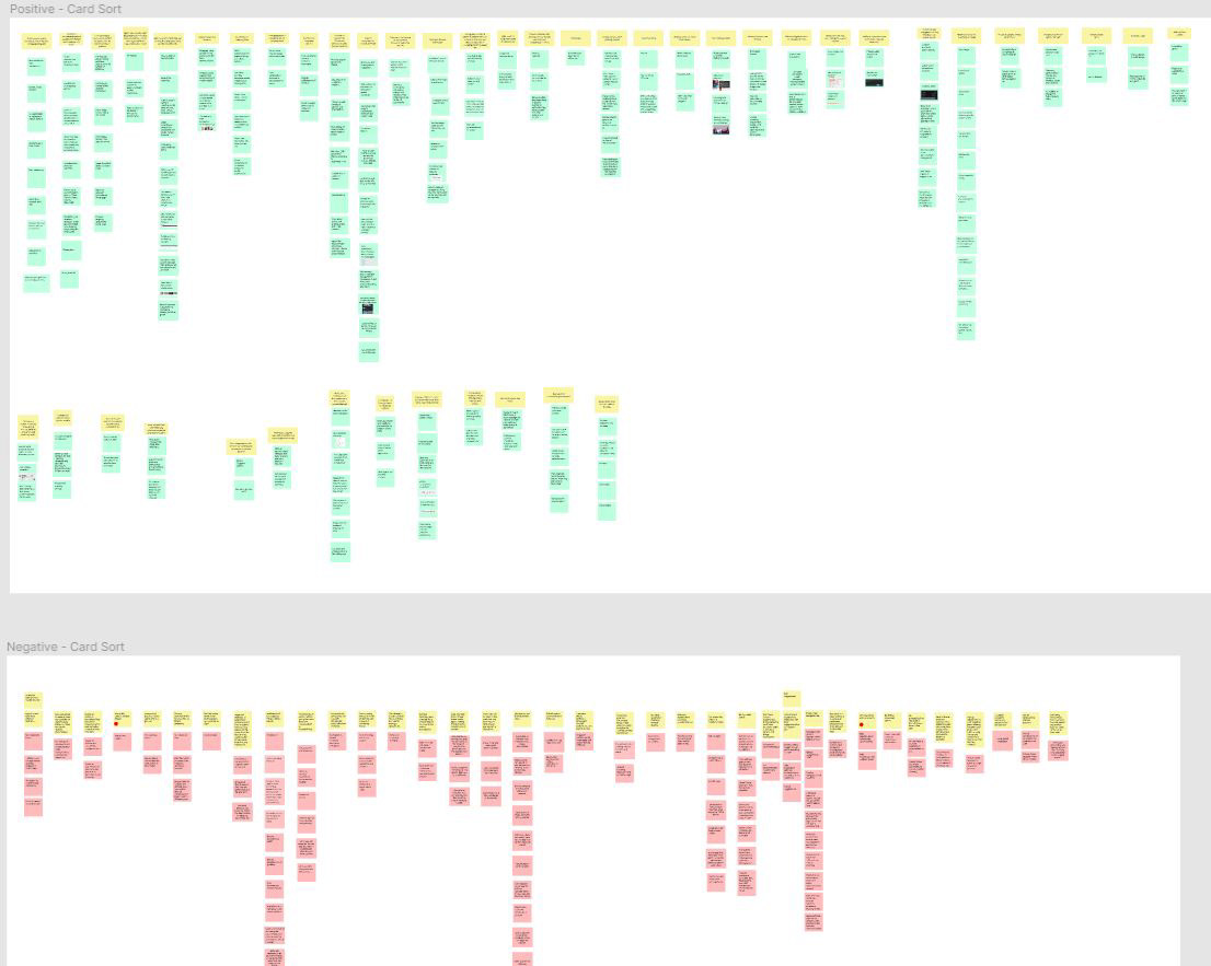
Card sorting the insight from competitors (green cards are positive point and red cards are pain points)
To keep in mind, we will use the positive findings as opportunity, and avoid the negative findings as pain points. Our team utilize red route to prioritize user needs and build the most valuable feature based on pain points
Prioritized Pain Points
After the card sorting for our competitor negative and positive points, we decided to move forward to see if VRV has similar pain points with the card sort pain points we just did. We need to narrow down our key problem. With this in mind, we were using red route graph to decide which pain points are worth to solve. Based on the graph, these are the pain points that we decided to focus on for this project.
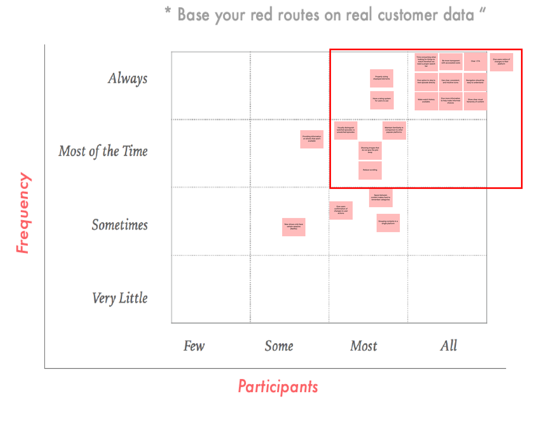
Red routes method shows which user needs that has more value to solve
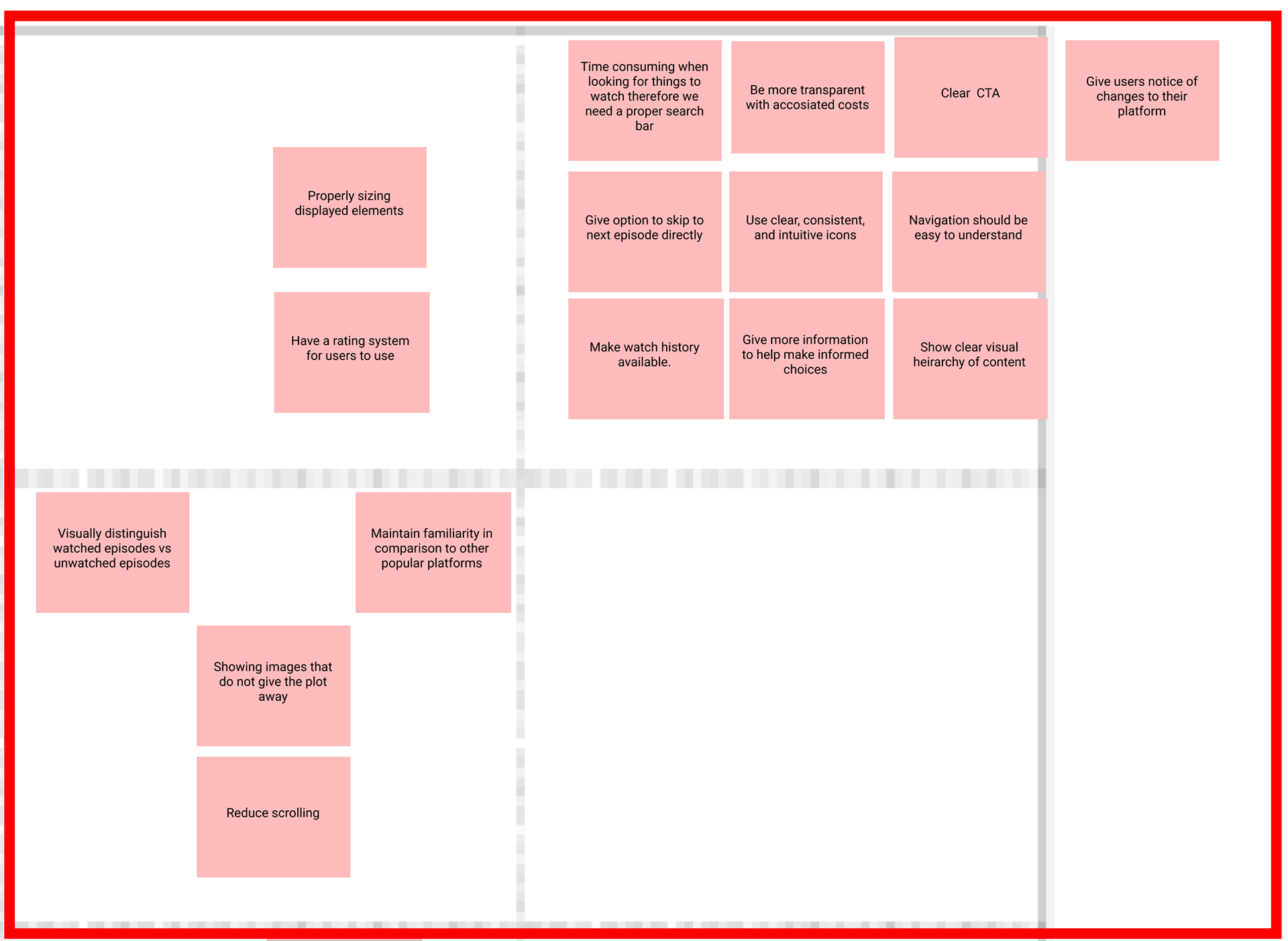
Zoom in the prioritized pain points that we needed to solve
Based on those pain points we have. We summarize and gather what we should do to solve these problems. These are our key problems and let's start to think how we solve them!
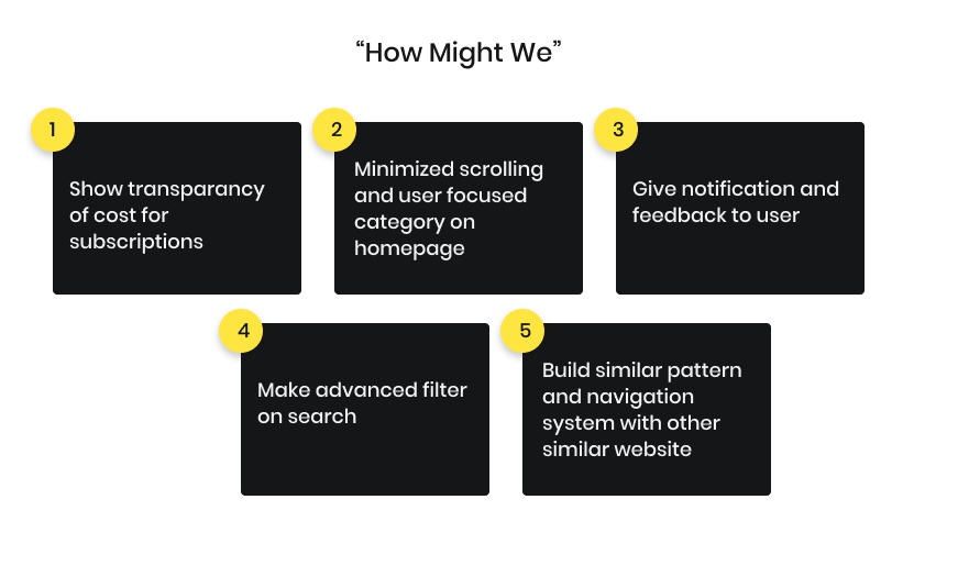
Key problems that we need to solve
Design Solution
We began with making low fidelity designs to solve current problems. This low fidelity were designed based on each flow the user have to finish their goals.
Afterward, we were finished with low fidelity. We have a built-in design system. This design system uses the atomic design method. We developed high-fidelity components based on the smallest element to be a complex one with a design system. We decided to use the main background color palate that VRV currently has and do a minor CTA color change into color-blind friendly.
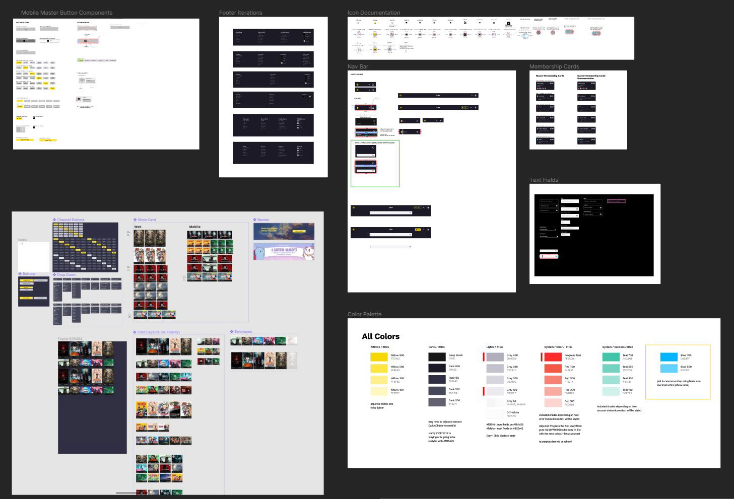
Screenshot of Figma file featuring commonly used design elements
The solution
I started creating the information architecture with low-fi concepts for primary use cases. After having a go-ahead from the design team members, lead, and developer on the mockups and design system, we began digitalizing designs. We used our new design system to make high fidelity design.
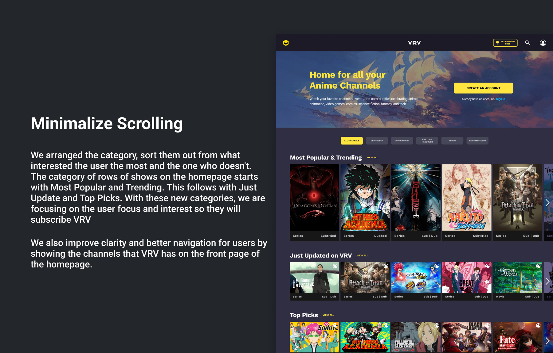
Homepage
We reworked our homepage based on the pain point and opportunity we found in the research phase. As we plan to increase the subscriptions and user engagement with the content, we changed the show descriptions into a poster that have self-explanatory. User can see browse more show in a row with this new redesign and minimalize the scrolling time
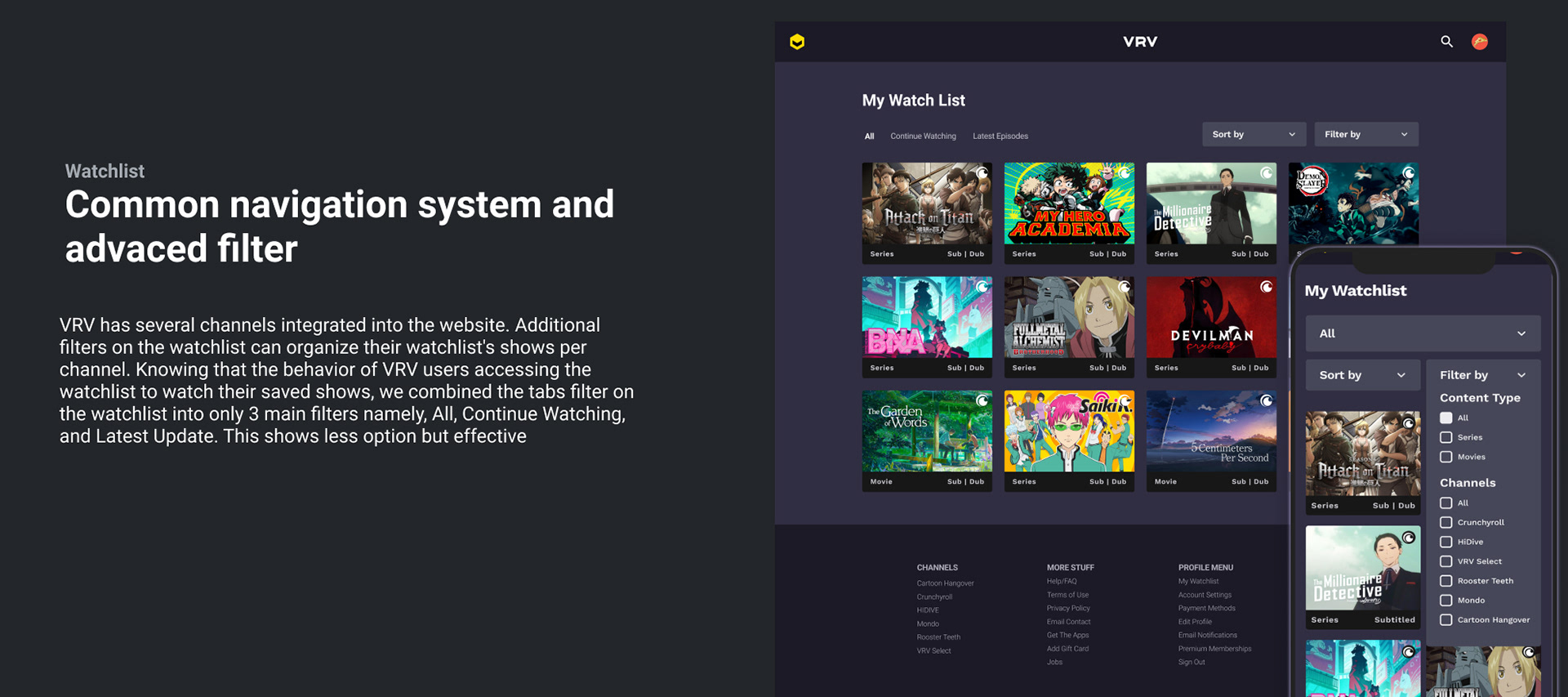
Watchlist
Saved your shows to watch later or the rainy days. We focused on mimic similar pattern on the watchlist with another similar streaming website out there.
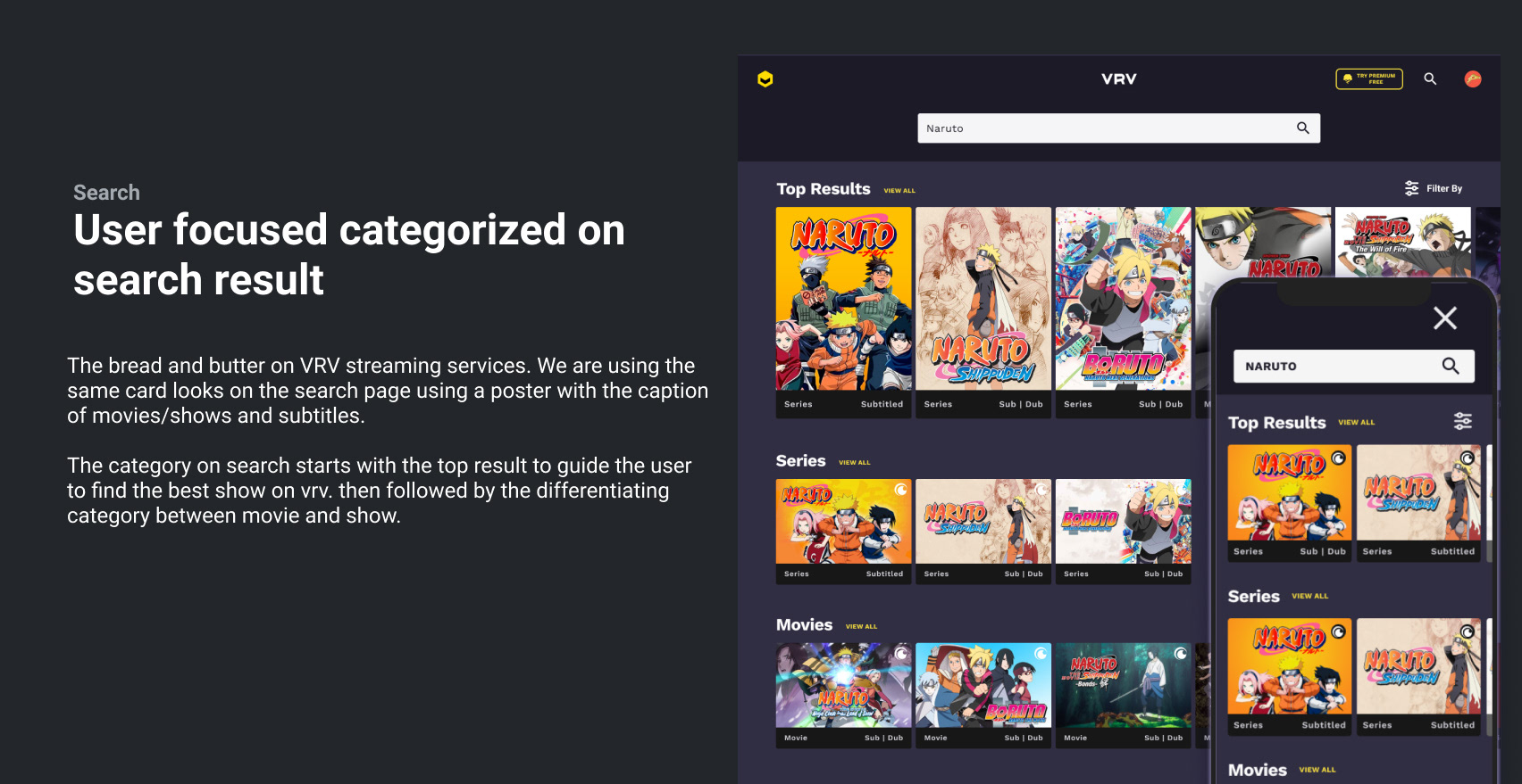
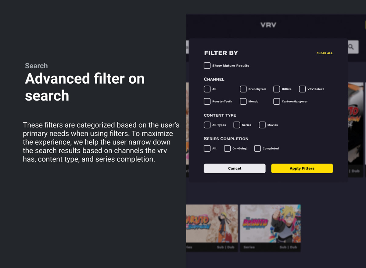
Search
The most used feature on the entire website. The bread and butter on VRV streaming services.
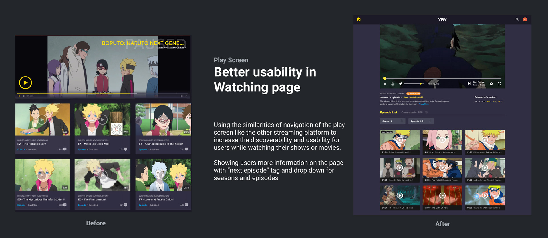
Play Screen
Providing better usability and accessibility while user are watching on website and mobile website.
Our First Design Iteration and what we learned
In the first design, we tested our design with 5 users. Based on the result, 100% of users feel this redesign is better than the current VRV website. In the payment page, we made some changes to improve the discoverability and usability of that page. We made clear CTA and bigger payment cards to show user which one to click to see more details.
Through the testing, we found out that users understood the purpose of the page.
But there were a few problems that we noticed in payment page:
Through the testing, we found out that users understood the purpose of the page.
But there were a few problems that we noticed in payment page:
1. User don't understand what plan they get if they click free trial
2. User think that free trial button is free of charge, which is not
3. User said that they want to see visually what they can get if they choose the plan
4. User want to be able to use gift card as a payment method if they can
Problems - need more transparency of cost up front and more value
1. The visual on this page was not attractive. Lack of visual hierarchy and transparency issue in this page make user still don’t know which better plan to use and what can user get from each plan that is different that the other plans.
2. Form for payment is monotone and boring. There is no option to pay with other payment methods.
First Iteration payment page design. Left : Subscription's plan description. Right : Payment form
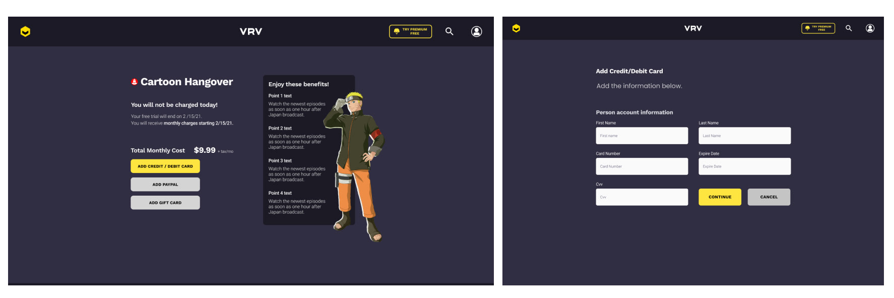
Second Iteration - Solving the problems from the user and the UI perspective
In the second iteration, we changed some elements in the payment page, but all the process/ framework that is used in redesigning is still the same.
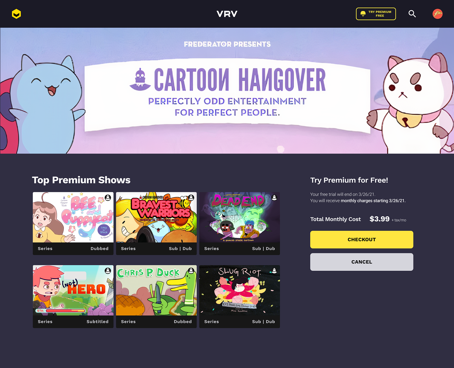
Second iteration design for subscription's detail page
Visual attraction and give more values in subscribing
We are using banner to make the visual on this subscription's detail more attractive. After the first usability testing, most users wanted to have more detail in what can they get after subscribing. By showing the top premium shows on this subscription's plan, this will help user to decide the best plan based on their favorite shows or movies.
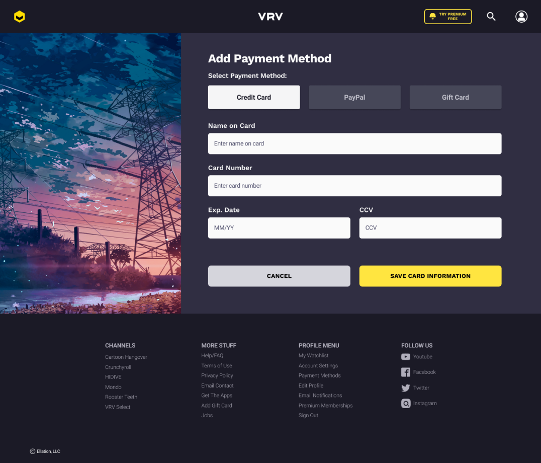
Second iteration design for payment form page
Clarity and simplified the form
Simplified and fix the visual by utilize the banner picture on the side to help with lack of visual and increase the font size for "add payment method" copy. We also add the tabs under "select the payment method" to choose the payment method using need without leaving the same page to avoid confusion.
Second Usability Testing
In this usability test, we tried different type of users to not just test the usability, but discoverability, and the accessibility. We interviewed 5 users that have color blindness and older users (45 years up and older).
Based on the testing result. 80% of our users are satisfied and prefer this redesign over the current vrv design. These are some insights that we gather for future redesign and improvement,
Key Insights during usability test :
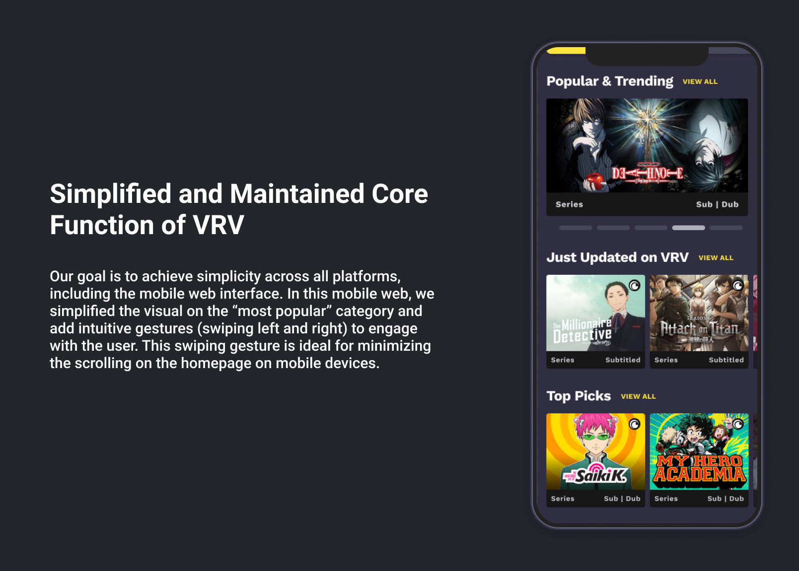
1. User like the way they can see so many shows/ movies at once in homepage
2. Most people talking a few or several time to familiar with the mobile web application but have no problem navigating and finishing the task in website application.
3. For payment page, user choose this new design look over the old ones.
4. Users still a bit confuse about the difference between free trial and subscription's plan, but manage to finish the task that was assigned to them, which is subscribe and pay for the VRV Premium plan.
Project Learnings
1. Simplicity is strength
As a designer, we are often lured by attractive, trendy and out of the box designs. But, We must always remember the ‘why’. The primary goal is to understand the user, their problems and then come up with a design that solves it.
As a designer, we are often lured by attractive, trendy and out of the box designs. But, We must always remember the ‘why’. The primary goal is to understand the user, their problems and then come up with a design that solves it.
2. Following the common design patterns.
This may sounds not creative, but as designer we have to know the rule to bend the rule. Our users are familiar with the competitor website and most streaming websites have similar pattern to finish the task (watch shows/saved the shows). So knowing that user's mental mode will help to design a product that have better usability.
This may sounds not creative, but as designer we have to know the rule to bend the rule. Our users are familiar with the competitor website and most streaming websites have similar pattern to finish the task (watch shows/saved the shows). So knowing that user's mental mode will help to design a product that have better usability.
3. Seek out feedback early and continually
The trouble with most of us is that we would rather be ruined by praise than saved by criticism. Keeping the stakeholders/users in loop and testing solutions in whatever form (paper, low-fi or hi-fi) as early as possible saves ample amount of time and re-work.
The trouble with most of us is that we would rather be ruined by praise than saved by criticism. Keeping the stakeholders/users in loop and testing solutions in whatever form (paper, low-fi or hi-fi) as early as possible saves ample amount of time and re-work.